Showing posts with label ink. Show all posts

Saturday, April 23, 2011

It’s Springtime!

That means it’s time for the annual realization among homeschoolers that the school year is running out followed by a refocused effort to reach goals, complete work, and get curriculum in line for fall. That also means that drawing projects are pretty much impossible for me right now.


However…I’ve found a few opportunities to work in the sketch journal, It’s forced me to seek and find something to record from the “everyday” without all of the extra planning and thought that goes along with an official project.


My 2nd effort during a trip to Barnes & Noble with commentary by the big-eyed redhead
(who noted that I was still doing a lot of writing and little drawing)
 
I prefer to work in pencil “on location” and then return to it later to ink and/or wash with color. I wouldn’t call my pages works of art in themselves, but I have thought about what a neat thing it will be to pass through the family. Perhaps it will end up in the hands of a great-great-grandchild who has never met me but will have this illustrated personal record of people, places, and things in my life. I like that idea.


At the park with Lindy.  Not colorized yet - maybe I'll get a chance once summer gets here.
 It’s also just nice to be able to keep up the drawing.

Saturday, June 6, 2009

And now for something completely different...


Well, the family is away camping this weekend - except for the baby and I, of course. I haven't had this kind of free time - after Lindy goes to bed - in a long time! I can actually consider going beyond the quick(er) pencil drawing for Illustration Friday.

I don't have anything to post on the IF theme yet. But, I'm goin' "color" for a change. That's right, stepping out of the old comfort zone and working with paint. My internal debate has been over whether to do an ink drawing filled in with watercolor (not really a step outside the zone as it still relies on drawing), or work completely in acrylic (my nemesis). Funny thing is, there are different parts of the design that would work well with one rather than other.

But, no. It's time to face my demons and do something different. I'm very detail-oriented in drawing (to state the obvious), and painting is a looser medium. I'm actually quite drawn to painterly works, but have a hard time doing them myself. Just...can't...stop...defining.


But, then again, there is such a thing as a fine bristle brush. It may not be popular in these modern times, but who says I can't do something detailed in paint, by golly. I wasted an earlier art life thinking to hard about what was modern and new stylistically. Think I've learned my lesson - my natural tendencies are how God made me unique. I'll just squeeze out the paint colors and see what happens - I've had better results with that approach.


So, the above post is a resurrected painting in acrylic in anticipation of what's to come (sorry if you remember seeing it before).

Thursday, October 16, 2008

Illustration Friday: "Strings"


I made it - just under the wire. Since this is the week I don't teach my class, I really wanted to try and do something for IF. (Click on the picture to see more detail).

I always chuckle when I see those rope lines meant to get young kids from point A to point B. The kids are always doing different things as they move along, usually getting distracted, BUT they dutifully hold onto the rope. I once watched one little girl who was bringing up the rear as she looked everywhere except where she was going, just following the tug of the rope, and she ran smack into a door frame (barely phased her - she was fine).

Anyway, that's what jumped into my head when I saw the topic.

I hope to add color to this one day, but I knew that wasn't going to happen before they changed the topic. I'll repost it in the future. I can see that I really have to make an effort to carve out time to work on illustrations these days with everything going on. And, it's only going to get busier as the holidays approach (YIKES). Oh well, such is life...

Saturday, July 19, 2008

Illustration Friday - "Enough"

At first I wasn't sure what I'd do for this, but the first thing that popped into my mind was a song called "Enough." Then I remembered a sketch I'd done about 4 years ago - I was doing a lot of stained glass back then and it was a design for a glass panel (entitled "Ascension"). It also reminded me of one main aspect of my faith - that Christ's death and resurrection were "enough." The debt is paid in full.

When designing for stained glass, you have to consider things like how to divide up the picture into pieces that aren't too impossible to cut out of glass (which prefers to break in a straight line). In this drawing, I was able to disregard some of those restrictions, such as allowing the hand to extend beyond the frame. Being a religious theme, however, I thought it appropriate to keep the stained glass design quality in the shapes.

I never got a chance to make the panel, but I would like to someday. I did not add any color because I intend to use different textures of clear glass or very subtle colors. Maybe some day...

Tuesday, July 1, 2008

Saturday, June 28, 2008

What's new...

I've started up with the local free community college illustration course on saturday mornings. There's really not a whole lot of instruction - it's more of an "independent project/discussion" situation. We come up with our own projects that we want to work on and not everyone who signs up has an art background.

It only meets for 6 Saturdays over summer, and it's an opportunity for feedback and a social outlet. I've been watching the SCBWI calendar for my region and there's been squat for illustrators - everything is for writers. Seems I'll have to consider driving to Los Angeles.

Anyway, I've been spending time between doctor visits (my daughter got a lovely blue cast this morning) working out my idea for that class. So, again, not much has happened in the studio. The project will be a series of about 12 illustrations - not really child oriented, but more personal. It will be a different direction from what I've been doing, so I can't wait to see what comes out. It certainly won't be finished in 6 classes (but that's the nice thing about taking this "class" - no grades, no deadlines - just participate).

I think I will be using ink again. I like the ink and colored pencil combination. So, in honor of that - and since I don't have anything else to share - here's an ink sketch of a tree stump in our backyard. Then again, since the concept is quite different, perhaps I'll use something like charcoal and pastel (gasp!).

Thursday, June 19, 2008

Umber is my friend...

Added color to "A Dinner Invitation" using watercolor. Overall, I'm pretty happy with it.


Before I painted it, I played around with some color mixing using my (VERY limited) assortment of watercolors. If there was one thing I remember from my college art instruction, it was the emphasis on getting darks by mixing complementary colors and avoiding black. I never really paid much attention to the siennas and umbers at all (remember - I tended toward the vibrant expressionist color palette back then).


I did have one instructor that required paintings done each week with limited color palettes (as dictated by him). I think it was a great exercise, HOWEVER there just wasn't time enough for me to really get into it and learn from it. I just always felt more focused on getting it done and moving on to the next thing.

Anyway, I have found that I LOVE umber - my new color friend. I love the earthiness it brings to colors - darkens them but keeps them warm (where black darkens but cools). I used both light and dark umber A LOT in the chicken drawing with colored pencil, and I used dark umber in many of the colors in today's painting.

Wednesday, June 18, 2008

More studio fun...

While the house is still a bit cluttered with leftover school year stuff, I'm enjoying FINALLY having studio time! I can't quite bring myself to face the stacks of papers and books...I'll do it tomorrow (famous last words).

Anyway, I went through the last few months of sketchbook doodles to see if anything spoke up. A little bird did - and I'm back to ink (watercolor will follow). It's changed only slightly. I call it "A Dinner Invitation."

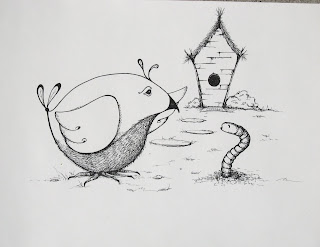
The inspiration for this was a small doodle (shown below) tucked away on a page full of "random musings" done in ink and posted several weeks back. It was hard to notice it among all of the other stuff on the page, but I liked it and it's been calling me.


Tuesday, April 29, 2008

Switching Gears...

I've been working a lot in pencil recently, expanding my horizons a bit more with my "comfort" medium. While I've always enjoyed working in pencil, I am able to work more quickly and decisively with it.

I've completed the anatomy studies now, having done the muscles of the face and neck at work the other night. I think that's all I'm going to do on that subject for the moment. Eventually, I might find a resource that will show the muscles from different angles and in different poses - particularly the arms and legs.

I don't know how artists are content working in a single style or medium. Too much of one thing gets a little dull after a while, and I'm looking forward to branching out. I'm anxious to work with other media and explore different approaches, different looks. Switching to ink, I played around with some quick doodles just for fun today.


I've heard that some illustrators sometimes "discover" a character in their sketchbook - that it starts as a doodle or something random. Then, as the character develops, its story can evolve into a picture book idea. I'm hoping that something like that will happen with something I've drawn, but so far nothing has really struck me in that way.

Monday, March 24, 2008

Mission Accomplished...NEXT?

Well, I actually finished something that I've been thinking about - but was unable to get to - for months. I redid my sketchbook doodle of "Spectator Ant" and managed to bring it to some level of completion with watercolor washes this afternoon.


IMG_0475


I think I'm happy with it overall. I had originally only intended to do it as an ink drawing, so I used regular drawing paper and not a heavier paper. I was a little concerned about putting washes on it, that the paper wouldn't hold up very well. It did buckle a bit, however a low heat iron smoothed it out quite nicely.

So, what's next? I've got the week ahead of me (sort of). Should I do some new doodles? Or revisit old ones? Actually, there is one doodle that I'd like to redo since I destroyed it with an awful background. I'll share soon.

Sunday, March 23, 2008

At Last...TIME!

HAPPY EASTER EVERYONE! It was a beautiful day here - warm and sunny (sorry to those of you in other parts of the country). I was a able to finally get some rest and feel a lot better than I have been the last couple days. And, my kids spent the afternoon with friends at the park down the street. Quite unexpectedly, I ended up with a big block of free time - time that I was able to spend in the studio!

No games or warm-ups today; I went right into a project I'd already started. It was a redo of a doodle that had been in my sketchbook. The thing about doodles is that sometimes lines, shapes, gestures, and values get sealed into the drawing before you determine what it is you're actually making. There's no going back and simply altering.

That was the case here. I had done the first drawing of the "Spectator Ant," but I wasn't happy with the way parts of it had turned out. I really haven't worked with ink very much, so I was out of my comfort zone - I didn't get the amount of contrast I'd wanted, and I was overly rigid with my cross-hatching.

So, on this redo, I was able to loosen up and do more of a "scribble" type of shading (like I do when sketching with pencil). I think it brings more energy to the image. Also, I fixed some things I didn't like - the eye and some general shapes and sizes. I added a little pizzazz to the flower and "super-sized" the ant's beverage. Note: the original doodle-drawing and details are all shown on the left - new improved "redo" details are all on the right (Complete "redo" is down on the bottom).

Overall, I'm much more pleased, although I don't know how much of a difference can be seen on the computer. Many of the changes were just technical, gestural, or cosmetic, but even a few small changes can still make a big difference. Now, I'm deciding whether or not to add some color - probably watercolor washes.

I think I will...