Showing posts with label background. Show all posts

Monday, May 7, 2012

Busy Day in the Kitchen

Today was a day of much progress in the kitchen...not MY kitchen, unfortunately.  I actually mixed several grays for the pot and the chef's pants.  But, one of the more time consuming things was mixing a batch of skin tone (probably should have done that a while ago, but I worked in small amounts on the palette before).  Now, I have a lot of a good base that can be tweaked a bit, depending on the figure.  I know I'll have some touch-up as I go back through the panels with detail. 


I'll definitely have to touch-up the chef as I need to rework the background around him.  There really isn't enough contrast between the background yellow and the fleshtone.  I'll probably mix the yellow with a touch of white to help create more contrast, but also because the yellow is so transparent, it doesn't cover anything!  So, sketchy pencil lines are still visible after several coats, not to mention painted lines that are no longer needed.  That's why you see patches of white around the figure - those are areas that needed to be covered (the big splotches of white, however, are future vegetables - and there'll be a lot more of them).


I always like seeing the panel in a photograph because "issues" are clearly visible (they're not as obvious when you're staring at the panel close-up).  My goal isn't necesarrily to have a completely anatomically correct figure - especially since the chef is quite a "character" - but there are often things that bother me and seeing a photo often helps me identify them.  Oh, and I know he only has half of a mustache.  No point in painting the other half until the background gets reworked.

Again, details will be adjusted and sharpened - but you get the idea.


Thursday, May 3, 2012

Seeing Yellow - Lots and Lots of Yellow

The nice thing about working on panel 5 is that it's a nice break from the multitude of detail on panel 4.  I covered a lot of real estate this evening just by working on the background.  The downside, however, is that because I was working a little red into the yellow for texture, I had to work without stopping in order to blend the colors before they dried completely.  And, since it was a larger area, I was using larger strokes...I feel alright right now, but I think my arm will fall off tomorrow morning.


Thought y'all might be interested in seeing more of the panels in one shot.  Since I don't have room to put all of the panels side-by-side, you'll have to fit them together in your mind.


At the end of it all, I will have to move certain panels together in order to finish them properly.  They're quite heavy, though.  So, I'll complete everything, do a little rearranging, and then finish off those objects that cross panels.


Monday, May 5, 2008

Bathing Beauty Revisited

IMG_0596
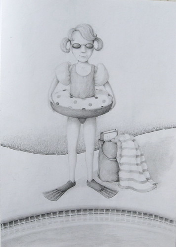
Ok, I think I brought this one to a resolution. I was stuck for a little while - there was too much negative space before, but everything I added just cluttered the scene. Everything seemed to draw attention away from the figure. So, I posted it on Amateur Illustrator, got some feedback, and this is what I came up with.
Simply adding another edge behind the figure definitely improved it - the figure feels more grounded, the space a little better defined. But I think this is one of those instances where the blank, white space is necessary. The white space to the left of the figure's feet balances the bag and shadow that are off to the right. The large amount of empty space in the upper half of the picture balances the multiple patterns and darker values toward the middle and bottom.
The thought has crossed my mind - what could I put in the upper part of the picture? I tend to like to place elements (objects, values, patterns, etc.) around to draw the eye around the composition. But, I come up with nothing that would fit or make sense - the empty space is serving that purpose without stealing the spotlight, allowing you to focus in on the girl and all her gear.

Wednesday, April 23, 2008

Background Setting - The Saga Continues...

I spent what little drawing time I had today trying to figure out the setting for the bathing beauty in my sketchbook. Here, I've uploaded an only slightly better picture than before (although not much).
I tried a couple different things in the background - lounge chairs, a pool. There didn't seem to be a good place for the horizontals to pass behind the body, and whatever I did put in seemed to compete with the polka-dot floatie that I happen to like.


So, you can see in this picture that I've roughly sketched in the edge of the pool in the foreground and I like that a little better. I also have a bag and towel that I may, or may not keep in the scene. Seeing it on the screen, I feel like it should be moved closer to the figure. Also, if I keep it, I feel like there needs to be something else in the scene as well...but what?

Of course, these days it seems like unexpected challenges creep into my drawings beyond those I originally set out to explore. I suppose that's just where I'm at in my studies. I'd love to be at the point where I have so much experience that I can just follow an idea to it's completion. Is there such a point? However, in this case, I've never rendered water in a pool, so that's something new I'll have to explore.
I do enjoy solving the puzzles that each drawing presents. I just wish I had more time.

Tuesday, April 1, 2008

A Study in Backgrounds

One of the areas in need of work that I failed to list on my things "to do" is to practice background work. Whether my images are doodles or preconceived, it's easy for me to become completely preoccuped with the subject itself and treat the setting as an afterthought. The temptation is to complete the subject and move on to something new. But, needless to say, ignoring the background isn't going to help me in the illustration world.

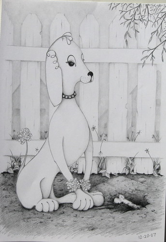
The image shown here was started as a doodle but with the intent to place whatever evolved into a setting of some sort. The inspiration for the doodle came from a metal spiral handle on a condiment caddy at Carl's Jr. (the spiral line on the ear of the dog). Once I knew what the subject was going to be, I placed the fence behind it. I almost stopped there, but since this was an exercise in backgrounds, I opted to push it further. I then added the structures behind the fence, the overhanging foliage, and defined the foreground detail.

IMG_0378

I was pleased with the background overall - the scale and value of the buildings really sets them off in the distance. However, if I was to redo this as a final work, I would give the dog more of a dynamic pose. This is one of those situations where, since it started as a doodle, certain aspects of the drawing were committed before I really realized what it was going to become. In this case, the stiff pose was unchangeable.

Now, one more thing I've come to realize about backgrounds is that some images are better off WITHOUT them. I mention in the intro to this blog that I would include my "failures" as well as successes throughout my journey. So, begrudgingly I post the original doodle drawing that became the plant-like clownish characters of a couple posts ago. Wanting to practice backgrounds, I created one for these characters. The detailed folds really competed for attention and the vine-like linework of the drawing were lost in it.