Showing posts with label figure. Show all posts

Friday, March 29, 2013

Hoping for a Productive Week Ahead...

Easter Vacation is officially here!  The girls finished up their classwork today and we all have a break for the next week (from school, anyway).


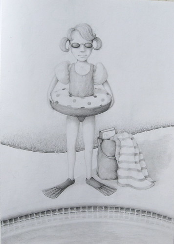
The new painting is underway and surprisingly farther along than I thought!  Earlier this week, I started with a pencil drawing which I painted over and refined with burnt umber - I wanted to take the time to get the proportions right.

Happy to have a use for leftover mural mixtures!

I realized that I had several color mixes leftover from the mural - some that I had mixed in quantity and kept in airtight containers - that would actually work with this painting.  Some will need to be adjusted slightly, but they were well suited for the underpainting portion of the project.  Sooooo, I was able to get started.

Underpainting underway...

BUT, I hesitate to say that this painting will go quickly, even with all of my studies and pre-mixed colors.  I've done that before and there's always something that I get hung-up on that extends the project for a while.  I can still hope, though, and I do know that the time I took with the studies has helped me a lot.  After all, it's a complicated pose, especially when it comes to the tilt and angle of the head - I fought with that one a while.  But, I was much more comfortable with it when drawing it out on the canvas (all freehand - no projector for this).


Meanwhile, while mom's busy painting in the garage, my youngest 2 have found a way to entertain themselves before the weather turns.  I'm not sure if this is a rain dance, but...


Monday, February 18, 2013

A Bit Rusty in the Figure Painting Department...

I've worked on the study over this extended weekend, and it's been a bit of a challenge.  Painting the figure has always been a challenge for me simply because I haven't done a lot of it.  What I have done has been more along the lines of illustration and hard-edge drawing.  But, I did manage to make progress and actually get some results that kind of work.

I painted out the face MANY times before I finally achieved the
"soft" look that I was going for - less is more...

This is just a study, and I may do another one just of the face to get a better grasp of it.  In the end, it will be a larger painting (as I think I mentioned before).

Thursday, June 14, 2012

Can You Spot the Differences?

I'm getting to the point in this panel where changes are smaller, so they may not be so obvious - little things here and there.


The most obvious addition was to start mapping out the wine bottle on the table.  I plan to add something else on the table, but I haven't decided what exactly that's going to be (decisions, decisions).  Also, you might notice that I've finally filled in the red dress, bringing that closer to completion. 

Less obvious is the repaint touch-up of the purple grapes that was needed after previous adjusting of the figures.  Also, I detailed the male figure's hand that's resting on the table - it had no definition and just blended in with the tabletop.


Last, but not least, I mixed up a darker dark for the grape leaves to add some deeper shadows and more contrast.  Happier with the look of it now, but I may add another dark before the job is done.

One revelation that I had tonight was how much focused thought goes into painting (for me anyway).  I know this because it seems that whenever I go out to paint, I am followed by a couple of kids - one that feels the need to be talking about everything that passes through her head (and this from the one we wondered if she would every talk)!  I love having my kids by my side, but it's very hard to think about what I'm doing AND respond to her.  I don't think I ever realized just how focused I am when working.  I am now thinking that when my art class students are busy working, I should probably just shut up because they're probably not listening to anything I'm saying.


My other painting partner likes to buzz around on her own.  But, tonight she thought it would be fun to "help" with the mural.  She has her own paint brush, used to Disney Dumbo book as a "palette," climbed up on the step ladder, and got to work.

Future muralists of America - UNITE!

Tuesday, June 12, 2012

Moving On...

Woohoo!  I think I've done enough grape leaves for now and I'm ready to move on.


I even worked on the giant leaves behind the figures, but I started to run out of the "highlight" mixture.  So, I may still go back to it...but probably on my last pass through of "final touches." 

Darn flash glare!  Notice that I added a couple of leaves to
overlap the grapes.

For now, I think I'll move on to the rest of the panel - giant grape touch up, the female figure's dress, the tabletop (remember, there's supposed to be a bottle of wine there), and I need to fill their glasses.  Then, on to the architecture around the chef, floor touch-up, a few more veggies and the splash.  It may seem like just a little bit left, but there's still a lot to do in the first couple panels - there are supposed to be trees, details on the pumpkins (more leaves, and stems), and crops growing on the rows under the wave - things like that.  But, after that, it's all touch up detailing.  There's light at the end of the tunnel.

Still toasting with empty glasses - hmmmm, white or red?

Sunday, May 27, 2012

A Very Productive Saturday!

For the first time in a long time, I had a free Saturday.  I must have painted for about 8 hours overall (not without interruption, of course). 

I feel like I've spent a lot of time in the first two panels - especially because there were so many complicated issues on the tractor, the figure in the tractor, and the plow that hadn't been resolved.  However, there are a lot of details on these panels that I have yet to do, and they won't happen until the very end.  One of the last things I'll have to do is to get some of these panels exactly side by side with no gaps to make sure things line up. But, for now, I just measure where I can and "eyeball" it when I can't.


I started today by working on the pumpkins again, adjusting some of the shadows and highlights a little.  Then, I moved on to the wave of soil - a larger area of color to troubleshoot and blend.  Once you start working on an area like that, you don't want to stop - gotta keep blending before the paint dries.  And, working on this part took me back into panel #3 again.


Then, I moved on to the cauliflower.  I didn't like the highlight color I had used for the vegetable's leaves in the first layer - too blue.  So, I mixed a bit more yellow in and that worked better.  I also worked on the cauliflower itself, stippling with and a light purple for shading.  There's still detailing to be done or adjusted there.


The last thing I did was to "plant some crops" in the far field.  That took a little extra time because I tried a few different greens before I found something I liked.


I love seeing how everything is starting to build, little by little.

Tuesday, May 8, 2012

The Camera Doesn't Lie...

Isn't that the saying?  Well, it's true.  As predicted in my previous post, a photograph brings into focus anything that isn't working in the painting.  I quickly saw problems that I couldn't quite put my finger on while I was in the process - mainly the uncomfortable position of the right arm, the awkward fingers, and the shortened legs. 

Likin' the lighter background

After working on a lot of that panel in one day, I think I was coming up with excuses as to why I don't really need to repaint anything.  But, with the dawn of a new day, all issues have now been corrected.

There's A LOT of produce in my future

I raised the arm up a little, but a simple (yet important) change was simply changing the direction of the fold shadows on that forward shoulder.  The hand came together smoothly and looks more natural.  The legs experienced a growth spurt from the knew down.

Oops!  Forgot to add the other half of his mustache,
now that the background has been lightened.

I also touched-up the background with the yellow/white mixture, so the skin tones stand out quite a bit more.

My "littlest" fan!

Monday, May 7, 2012

Busy Day in the Kitchen

Today was a day of much progress in the kitchen...not MY kitchen, unfortunately.  I actually mixed several grays for the pot and the chef's pants.  But, one of the more time consuming things was mixing a batch of skin tone (probably should have done that a while ago, but I worked in small amounts on the palette before).  Now, I have a lot of a good base that can be tweaked a bit, depending on the figure.  I know I'll have some touch-up as I go back through the panels with detail. 


I'll definitely have to touch-up the chef as I need to rework the background around him.  There really isn't enough contrast between the background yellow and the fleshtone.  I'll probably mix the yellow with a touch of white to help create more contrast, but also because the yellow is so transparent, it doesn't cover anything!  So, sketchy pencil lines are still visible after several coats, not to mention painted lines that are no longer needed.  That's why you see patches of white around the figure - those are areas that needed to be covered (the big splotches of white, however, are future vegetables - and there'll be a lot more of them).


I always like seeing the panel in a photograph because "issues" are clearly visible (they're not as obvious when you're staring at the panel close-up).  My goal isn't necesarrily to have a completely anatomically correct figure - especially since the chef is quite a "character" - but there are often things that bother me and seeing a photo often helps me identify them.  Oh, and I know he only has half of a mustache.  No point in painting the other half until the background gets reworked.

Again, details will be adjusted and sharpened - but you get the idea.


Monday, April 30, 2012

Moving Along (...at last)

It was nice to spend a good chunk of time on the mural today after a VERY busy weekend (which included a girl's craft party at my house, Artist Reception at Town Center Gallery, Pinewood Derby at church, 2 kid soccer games, 1 whirlwind trip to LA for an MLS Galaxy pro soccer game, Sunday church service, a birthday party...you get the idea)

So, after the girls got started on their schoolwork, I was able to sneak out to the garage and get back to the "Cheers" panel.  As you can see, much was accomplished, although a lot is left to do.  However, I think I've gotten a good enough first layer of detail to move on to panel 5 for a while.  I'm looking forward to working on something besides grapes and using some different colors.

I like how the barrel turned out - it's always exciting to
see the image building with every detail.

Now, if you're keeping score of changes made to the original design, you'll notice another one here.  The male figure had a slight costume change - he traded in his brown jacket for a dark navy-ish one.  I never really liked the brown one in the original design as it seemed like there was just too much brown goin' on.  I knew I wanted to have him in blue jeans, so my fashion-forward teenage daughter suggested this color.  Works for me!

Wednesday, April 18, 2012

Solving Problems...

I'm REALLY glad that the mural is being painted on panels which allows me to work in the garage around my schedule during odd hours!  I don't feel rushed, yet I feel like I'm still getting things accomplished (even with daytime demands).

This evening, I played around with the grape colors, bringing them closer to what I want.  I still need to build up layers and values.

Before
After
I also worked out a couple of issues with the figures - particularly the man.  I dealt with the NCS, or Narrow Chin Syndrome, as well as the Big-Footitis that he suffered from.  He really had too much heel - the heel was more profile while the front of the foot was more 3/4 view.  Anyway, he's been healed - Hallelujah!  (And "heeled," I guess).


Friday, September 26, 2008

Lamenting My Lack of Illo Time on a Very Special Day


My son and I were going back through the pages of my sketchbook as I am just a few pages from filling it. I really enjoyed my time drawing and painting in this past year, and it's been pretty difficult to find the time lately (or the motivation when I do have the time). But, such is life right now...

I did recently do some sketches of various characters. I've only pictured one of them here (guess I forgot to photograph the other - baby brain). While it's Li'l Red Riding Hood-ish, that's not what was motivating me. I can really get in a rut, drawing things in the same way all the time, so I just wanted to play around and try to do something with a little different "feel." I don't know if I was successful - I don't think I can divorce myself completely.
The figure is always a challenge. I'll do something that I sort of like, and then I'll see other people's work that is different (and impressive), and it makes me want to try a different angle. I guess that goes back to my desire not to pigeon-hole myself by limiting my style. In the long run, I don't know if that's a good thing (I'd like to think it is). But, I think I'd go nuts if I was simply drawing illo after illo in the same style. Exploring and inventing are half the fun!
Anyway, today was a very special day because my youngest turned 6 years old! HAPPY BIRTHDAY JOLEY!


Tuesday, May 20, 2008

Thanks For the "Gesture"


I guess did get a little drawing in this last week. Work was really slow last Thursday, so the boss called and told me not to come in (I really needed a break anyway). So, I was able to attend my daughter's last soccer practice of the season and, of course, took the opportunity to draw.

I used to hate doing quick gesture drawings like this when I was a student. I guess I found it rather frustrating - my desire for detail and a finished product that looked "good" overshadowed things. Even these probably have more detail than a true gestural drawing should have.

I had a figure drawing instructor that took us to a fencing club in Culver City over several days for the purpose of capturing quick action. It was tedious at first, but it did get easier. Of course, I did absolutely NO gesture drawing for years. But, now I really appreciate the exercises. It's so easy to take a moment and scribble a few figures who might be around and add to the sketchbook "reference library."

Monday, May 5, 2008

Bathing Beauty Revisited

IMG_0596
Ok, I think I brought this one to a resolution. I was stuck for a little while - there was too much negative space before, but everything I added just cluttered the scene. Everything seemed to draw attention away from the figure. So, I posted it on Amateur Illustrator, got some feedback, and this is what I came up with.
Simply adding another edge behind the figure definitely improved it - the figure feels more grounded, the space a little better defined. But I think this is one of those instances where the blank, white space is necessary. The white space to the left of the figure's feet balances the bag and shadow that are off to the right. The large amount of empty space in the upper half of the picture balances the multiple patterns and darker values toward the middle and bottom.
The thought has crossed my mind - what could I put in the upper part of the picture? I tend to like to place elements (objects, values, patterns, etc.) around to draw the eye around the composition. But, I come up with nothing that would fit or make sense - the empty space is serving that purpose without stealing the spotlight, allowing you to focus in on the girl and all her gear.

Wednesday, April 23, 2008

Background Setting - The Saga Continues...

I spent what little drawing time I had today trying to figure out the setting for the bathing beauty in my sketchbook. Here, I've uploaded an only slightly better picture than before (although not much).
I tried a couple different things in the background - lounge chairs, a pool. There didn't seem to be a good place for the horizontals to pass behind the body, and whatever I did put in seemed to compete with the polka-dot floatie that I happen to like.


So, you can see in this picture that I've roughly sketched in the edge of the pool in the foreground and I like that a little better. I also have a bag and towel that I may, or may not keep in the scene. Seeing it on the screen, I feel like it should be moved closer to the figure. Also, if I keep it, I feel like there needs to be something else in the scene as well...but what?

Of course, these days it seems like unexpected challenges creep into my drawings beyond those I originally set out to explore. I suppose that's just where I'm at in my studies. I'd love to be at the point where I have so much experience that I can just follow an idea to it's completion. Is there such a point? However, in this case, I've never rendered water in a pool, so that's something new I'll have to explore.
I do enjoy solving the puzzles that each drawing presents. I just wish I had more time.

Sunday, March 16, 2008

More on Character and Style – Depicting Different Ages

While we’re on the topic of character development, the project mentioned in the prior post required me to deal with another issue – how to show a character’s intended age.

My background in fine arts means that I have taken several classes related to the figure. However, there was never any opportunity to really compare anatomical differences between adults and children; we just focused on the (always) adult model before us.

So, that brings me to the main character of the book – a girl about 8 or 9 years old. I dove right in and created, playing with line, texture, and gesture. I was pleased with the result…at first. In time, and with some valuable insight from others, I realized that she appeared much older (and more sassy) than I wanted. Not to mention, I got a little overzealous in creating a shadow at the hemline so she looks a little “hairy” on the legs. Anyway, it was clear a redo was in order and the result is shown below (1st attempt on left; redo on right)

IMG_0391 IMG_0392

This realization forced me to study more closely what characteristics make a toddler a toddler, a child and child, a teen a teen, etc. There’s the familiar head count – a standard male is about 8 heads high and a toddler is about 4 heads. Everyone else is in between somewhere. And, to tell the truth, I had to look that up – I tend to eyeball it myself.

But, in general, I found younger kids to have larger heads, rounder cheeks, and shorter necks along with their shorter stature. They might also have longer lashes, thinner brows, wider set eyes, and more indention at the corners of the mouth.

A couple of helpful resources that I used was the tried and true “Drawing the Head and Figure” by Jack Hamm, and “Drawing People” by Barbara Bradley.