Showing posts with label study. Show all posts

Wednesday, February 20, 2013

A Little Study...

Worked on a study - a close up of the face in order to troubleshoot some issues. The bad news is that I had a hard time achieving the "looser" painting style of the original.  I blame my little palette - in respect to the size of the study - since I would quickly run out of my color mixture.  I was unable to load up the brush and lay in a layer of color.  Instead, I was trying to make the color stretch and that resulted in thin, smooth and blended colors and it was frustrating to have to keeping stopping to mix colors.  So, note to self, when I go to work on the larger canvas, I'll have to make sure I have small containers of colors mixed (just like I did with the mural).


The good news is that with all of this painting and repainting, mixing and remixing, I figured out a skin tone mixture that I like a lot.  I had always used a lot of ultramarine blue in the shadows, but for this I went heavier with more burnt umber (inspired by a documentary about Manet that I watched recently - don't know if that's what he used, but I noticed his warmer, neutral shadows).

The last thing I have to say has to do with studies and redoing a drawing or painting.  I always tell my art students not to immediately write off a redo as bad or worse than the first. It will always look "different" in some way, and beginning artists often get frustrated because it does look different.  Usually, when I walk away from it for a while, I come back to find that it's not as bad as I thought, and there are some things that I might like better after all.  Or, I can learn something from the redo - as I did here.


Wednesday, January 9, 2013

Beauty and Grace

Today, I was able to spend time working on a study for the next seasonal woman/tree pencil drawing.  It's nice to be working on some projects again - I really didn't have time after the mural to do anything but school and holiday stuff.  But now I can incorporate regular (hopefully daily) work at the drawing table.  My goal for this year is to really put forth an effort to do something with my art, whether it's for illustration, gallery, or both.  My "featured artist" show at the Town Center Gallery in October is certainly a motivator, but I've been compelled to do something now that my youngest can entertain herself for longer periods of time.

My daughter snapped this shot of me at work

So, after sketching some ideas over the past few days, I went forward with a study.  I used to be too impatient to do a study - I always just wanted to go right in and do it.  I'm finally willing to accept the fact that I'm never happy with the result when I do that - there's always something that doesn't sit right and I end up re-doing it (even if it's years later).  At last, I'm content with doing the extra work to get a result that I'm happy with.

A glimpse of the study for "Summer"
I've also decided that, now that this is a series, the "mother nature" idea isn't really sitting right with me.  That may have worked for the first one, but seeing more than one representation, the sense of beauty and grace stands out more to me.  

Sunday, September 2, 2012

Mural Studies...

Went forward with a 2nd coat of varnish on the backs again today.  I'll be setting up the saw horses tomorrow.  But first, I have to de-clutter the studio zone a little.  Since it is in the garage, summer vacation sort of crept into my area - books, boxes, bikes, OH MY!


Anyway, while I had the varnish out, I also painted a coat on all of the studies I did during the mural  process.  Remember those?  I shared them along the way.  My plan is to frame them and probably put them up for sale in the Town Center Gallery.  I don't see the need to keep them.  Well, I might put a couple up for sale now and see how it goes.


Now that I'm anxious to paint other projects...I have no time.  Oh well...

Monday, May 28, 2012

Strawberry Princess

Since I was wiped out from a painting marathon yesterday, I relaxed most of the day after church and watched bad movies (you'd think a 3-day weekend would offer up some better options).
Anyway, I did venture out to the garage for a few hours and worked on a study for the strawberry girl.  She's the only major player in the mural that still had a lot to be developed.  Like the chef, it's a small study and the details are somewhat limited by its size.  Still, a lot of issues are resolved in the process.


Thursday, May 17, 2012

Forecast: Patchy Clouds and Blue Skies

Let the fun begin!
This is the "before"
This evening I thought I'd go back to the first panel, the first place I started over a month and a half ago - the sky.

The "after"
The first layer was just Cerulean Blue and white.  Going back through it, I am using the original mixtures plus an added mixture of the Cerulean and Ultramarine Blue which takes it a step deeper and darker = more contrast.  I work with 3 mixtures at the same time - dark, medium, and light. 

I kind of thought I'd get through more panels this evening, but I only made it through the first two.  But, this is my favorite part - I've got the basic color layer down, and now I can build and fine tune (OK, one of my favorite parts).


I also completed the tractor study.


Monday, May 14, 2012

Time to Get Out of the Kitchen

A few days off with lots of Mother's Day sleep!  Just what the doctor ordered.  I've had a lot of other things to think about lately with lots of end-of-year parties for all of our homeschooling co-ops and collaborations.  That, and trying to get some things in order for next fall (yes NEXT fall - gotta catch everyone before summer hits).

Anyway, last time I hinted at another intended change to the chef panel.  Can you guess what it is?


More veggies?  Nope.  Kitchen clutter on the back counter?  Nope.  I decided to frame the panel with a matching column on the right (not in the original plan).  Did you figure it out?   Now, see if you can find Waldo...

Just kidding. 

But, I do think this is my last evening working on panel #5 for a little while.  As we all know, one can only work with vegetables so long before it gets a little tiresome.  Luckily, I've got 4 other panels I can revisit. 


I've worked out most of the kinks in the kitchen and now I'm ready to start going back through the mural to build layers, values, details, fill in the unfinished, etc.  First, however, it's time for another study - since I'm headed back to the farm, I need to work out some details of the tractor that I haven't yet filled in.

Who's that lurking in the background...it isn't Waldo.


Saturday, May 5, 2012

Chef Study

The latest work in the garage involved a study of the chef.  After drawing and painting the original proposal, tracing/adjusting the figure on the panel, and now drawing and painting the study, I went back and looked at the chef in my sketchbook.  I did this when I was just playing around and brainstorming.  Drawing is more my strength and the sketch is much looser and fun. 

Original sketchbook "brainstorm" for the chef
The biggest difficulty and motivation behind the study was to figure out the right hand gesture.  But, since the study is small, I can only work out so much.  I kind of wish I'd gone back and looked at the sketchbook designs before I started painting - I might have taken the figures in a slightly different direction.  But, I also know that I'll always find something to second guess myself and I'm better off letting go of some things and letting the painting develop as it will (for sanity reasons).  The truth is that I'm learning a lot every day that I'm out there painting.  And, it's far from done - much more detail and "whimsy" will follow.

Photocopy of chef panel used in the projector and recent color study
My biggest lesson on this panel is the realization that the yellow that I purchased (which I chose because it was the most lightfast and permanent version of the yellow I needed) is probably the most transparent paint I picked up.  That explains why I've gone through more of it than any of the other paint colors.  It takes a lot more of it to cover anything and to create the mixtures that I've used for the various foliage.

In the past, I've had frustration with acrylic paint in general - mainly, the short drying time making which meant I had to remix colors frequently and the fact that it dries a slightly different color than it goes on.  But, with the Nova Color paints, the Sta-Wet Palette, and all the time spent working on this project, I can safely say that acrylics and I have made peace.  In fact, I plan to work with acrylic paint for more of my future illustration projects.

Monday, April 23, 2012

99 Clusters of Grapes on the Wall..

99 clusters of grapes,
You take one down, pass it around...


Guess I'll be painting more grapes on the wall!
(oh the things you think of when doing repetitious work)

The red and purple grapes are more developed at the moment, but the green grape clusters and the grape leaves have to be addressed still.

I've actually been taking some time to work out more detail at the moment and, honestly, my jury is still out on Dionysus - I go back and forth between liking him and not liking him.  I actually had something a bit different envisioned originally - something more sculpture-like and not "fleshy."  But this is what came forward in the study and I liked it. I'll have to get more of the panel done and see it as a whole - guess that's why I've been compelled to do a bit more detail beyond just the underpainting.  Plus, there's just a lot of little things in this panel and I want to make a good dent in it.


Saturday, October 15, 2011

Character Project

One of the things I've been trying to work on is a character study.  I know for illustration I need to be able to recreate the same character in different positions with different expressions.  So, I've been inching my way through such a project using this character that appeared among my doodles.


Although she seems rather simple, she's a good challenge for me (if you hadn't noticed, I tend to get caught up in details).  Instead, I'm trying to capture a lot with a little less than usual.  I'll share as soon as I can.

Thursday, June 18, 2009

Illustration Friday "Unfold" ...Sort of...


"How will this story unfold?"

Well, because of a convenient nap, I was able to get a color study done of my intended composition. This isn't the finished product, but it's all I could do before the deadline. I'll post the final some day - I'll let you know how it "unfolds."

So, the purpose of this study was to practice an interior, low-light scene. I went with a limited Thalo blue, Cadmium Orange Medium, Cadmium Yellow, Mars Black and Titanium White colors. I tended to use blue/black mixtures for the background and complementary blue/orange mixtures for the main subject and lighted areas, making them a bit more vibrant. I used the yellow in limited situations for warmth in the illuminated areas.


A big challenge was figuring out a good skin tone for this situation. But, overall, I think I did manage to learn something. So, hopefully, the final will be a little easier. It was worth it to do this rough study. It allowed me to be looser than I normally am and just focus on color.

Tuesday, June 16, 2009

Nothing's ever simple...


I found a character sketch in my sketchbook that I thought would work for this weeks Illustration Friday theme "unfold" - as in, "how will this scenario unfold?" I want to keep on with the painting practice, so that's my intended medium.


As I drew out the scene, I realized that this would be best as an interior setting in dim light.


Some of my favorite works that others have done have been set in low light - either outdoors or indoors. But, I've never really done one of my own before. Of course, that means approaching light and color in a way that is new to me. Therefore...research and color studies. And, if you've never stopped by James Gurney's blog, he's an outstanding artist and a regular wealth of technical art instruction. I did find some great images of light and color (albeit outdoor scenes) that have inspired me.


Anyway, rather than simply being able to sit down and start creating, I've had to do samples of different color mixtures, mainly in the blue and purple range mixed with black and umber (I already have studies of complements). Sometimes there's a sort of glow that can come from whatever the light source is, so I've also done a few mixtures with yellow.


I don't usually post my prelim sketches and studies for an IF theme, but then this is much more involved than usual (nothing's ever simple). But, I now have a nice reference sheet, although I can't say exactly which color I'm going to use in which part. I guess I'll just dive in and we'll see how this all "unfolds..."

Monday, July 7, 2008

"Green" - as promised...

As I mentioned before, I did another study in acrylics that I'm sharing here.

I've been working on this because (1) I need practice with the acrylics, and (2) it's part of the project I'm working on for my Saturday Community College Illustration Class. I won't go into too much detail about it at the moment, but I'll give you a little insight.


The project is sort of a memoir of illustrations based on several single words that I've chosen to represent different time periods. It took a lot of thought, a dictionary, and a thesaurus to pick the best word to describe each period. It's kind of an Illustration Friday approach to a project.

The word that inspired this particular study is "Green" - definitions used: not mature or ripe; young; lacking training, conditioning, or experience; undisciplined; unschooled.

I hope the nurturing adult, a child at the moment of discovery and wonder, and the springtime colors have captured the idea. The previous study used the same image, but the colors were darker - it didn't express the more joyous and carefree nature of youth very well. Instead, it seemed more solemn and dreary.

This was a challenging word to do. Again, I'm trying to loosen up and explore a more painterly style with the acrylics.

Thursday, May 29, 2008

Back to the Drawing Board...

My free time was recently consumed by the chicken project, so I ended up just stepping away from drawing for a couple days. Well, OK - I doodled in the sketchbook during break at work. I was trying to think of what I wanted to do next. There are several juicy little tidbits in the sketchbook that I was thinking I'd like to make into something. And, I'd still like to pick a passage from something we've read this year to illustrate.

In the meantime, this is a drawing from several months ago done in pencil (obviously) - something a little different.


HOWEVER...the more I tried to put the chicken drawing aside, the more and more I've been thinking of redoing it. Darn - I thought it might be done! It had taken a lot of time, but I know what I would do differently - fix the sign, add some of those string lights to all of the bushes, go for a little more gradation in the sky, and I saw a photo of some neon lights that inspired me to improve on that. I had observed neon signs around town, but something about the photograph made certain elements more obvious. There's A LOT that I would do the same - it's just a matter of spending the time to do it. But, if it's gonna go in the portfolio...

So, I guess the chicken drawing was just an elaborate study after all. But then, this is how it would be if this had been a paid job (not just practice) - gotta put your best work out there.

Friday, May 16, 2008

A Sneak Peek - Developing the Character

Do you recall the doodle that started me thinking about the chicken picture? Well, I realized that it really looked more like a parrot or cockatoo.

So, I did some chicken studies out of a book at work to identify more of their real characteristics.

The character now has more of a real chicken quality. This is a close-up of one of the studies I've been working on to determine some of the colors and compositional elements.


I've still got a little more to iron out, but I think I'll be diving into the final project pretty soon.

Thursday, May 15, 2008

The Importance of Studies

Way back in my student days, with a full load of classes, there never seemed to be the time to do studies before a final work. And, it was never really discussed by any of my professors - well I had one painting professor that assigned a series of color studies using a limited color palette. But at most, I might squeeze out a few quick sketches.
Even as I've worked on some things for the current portfolio, I haven't really engaged in doing detailed studies...until now. Some of the drawings I'd done earlier and really liked still had glaring flaws that could be the difference between getting an illustration job and not getting it. I realized that those drawings couldn't be considered as more than studies, and a couple of them have been redone. Looking at so many examples of great work through various blogs has motivated me greatly.

Now, I'm finding that as I work through my "chicken" ideas, I am really spending time working out many of the details before I begin. I'd hate to spend hours on it only to have a part "not work" (I'm not digital - don't have any delete or undo options). So, I'd much rather spend the time working out some of the unknowns before I dive in. That's not to say that I don't leave some things to unfold during drawing, but I'd like to have a firm understanding at the get-go where I want things, what colors would be right, how to get certain effects, etc.

Anyway, the picture I'm sharing today is of a tree in our backyard that has been semi-removed . My girls had set part of a bird-bath on top. I think we're going to cut it shorter, get a larger and more sturdy bird bath bowl, and plant flowers at its base...just waiting for that free time.

Saturday, May 10, 2008

Chicken Scratch

Moving forward with my “Chicken crossing the road” illustration.

So, last night at work I came across a Dorling Kindersly “Watch Me Grow” book about chicks. DK books always have excellent pictures to draw from since I don’t have any chickens lying around – at least not any that have heads, feathers, and aren’t currently frozen. I do have a mummified Cornish Game Hen from last year’s history co-op – but that’s another story.

Anyway, I spent my break doing some rapid studies of chickens in the sketchbook (shown here).


Besides that, I’ve decided what medium I want to use – sometimes that can be a tougher-than-it-should-be decision. I knew it wasn’t going to be paint or chalk pastel (grrrrrrr). But, I wasn’t sure if I wanted to use colored pencil alone (like the recent dancing fish), a combination of ink line and colored pencil, or ink with watercolor (like the Spectator Ant from earlier). After playing around with some colors in the sketchbook, I’ve decided on going with the colored pencil only option.

So, now I’ll be busy with some little studies and the final drawing.

Saturday, April 26, 2008

More muscles...

IMG_0578

Yesterday at work, I completed another anatomy study. I would still like to do the facial muscles, but I'd like to take some time now to work on other things. I don't work on Sundays, so tomorrow is open (Ok, after some housework, grading a few papers...ugh!).

I really like the shapes and patterns of the torso muscles - the way they wrap around the body, the symmetry.

I found the arm muscles particularly challenging this time. There's lots of them, for one thing. Also, the book I was working from - the one that had the clearest images - did not show the entire arm. It had a picture of the upper arm, and then 3 pages later it had the lower arm. So, I had to put the two sections together in the drawing. And, it appeared to me that the lower arm in the book was turned at just a slightly different angle than the upper arm. I hope I managed to get them together correctly.

Sunday, April 6, 2008

Dem Bones

My first figure drawing class is probably the only other class that, had I been the teacher, I would have handled a little differently. My main criticism is that we never did any anatomy studies – one would think that would be standard. I know that other instructors did require anatomy studies, and I took those instructors later in my education. But, I guess by that time they assumed we had all done it.

I do remember my instructor, a visiting artist from England, came into class one day after her review. She ranted that she had been criticized for not teaching “certain things” (not named) that she was never told she was supposed to teach. Fair enough – a lack of communication.

Of course, there was no one tying my hands behind my back, keeping me from doing it myself. But, as I mentioned in the previous post, I didn’t exactly have the spare time or the drive to pursue more projects beyond what I already had to do.

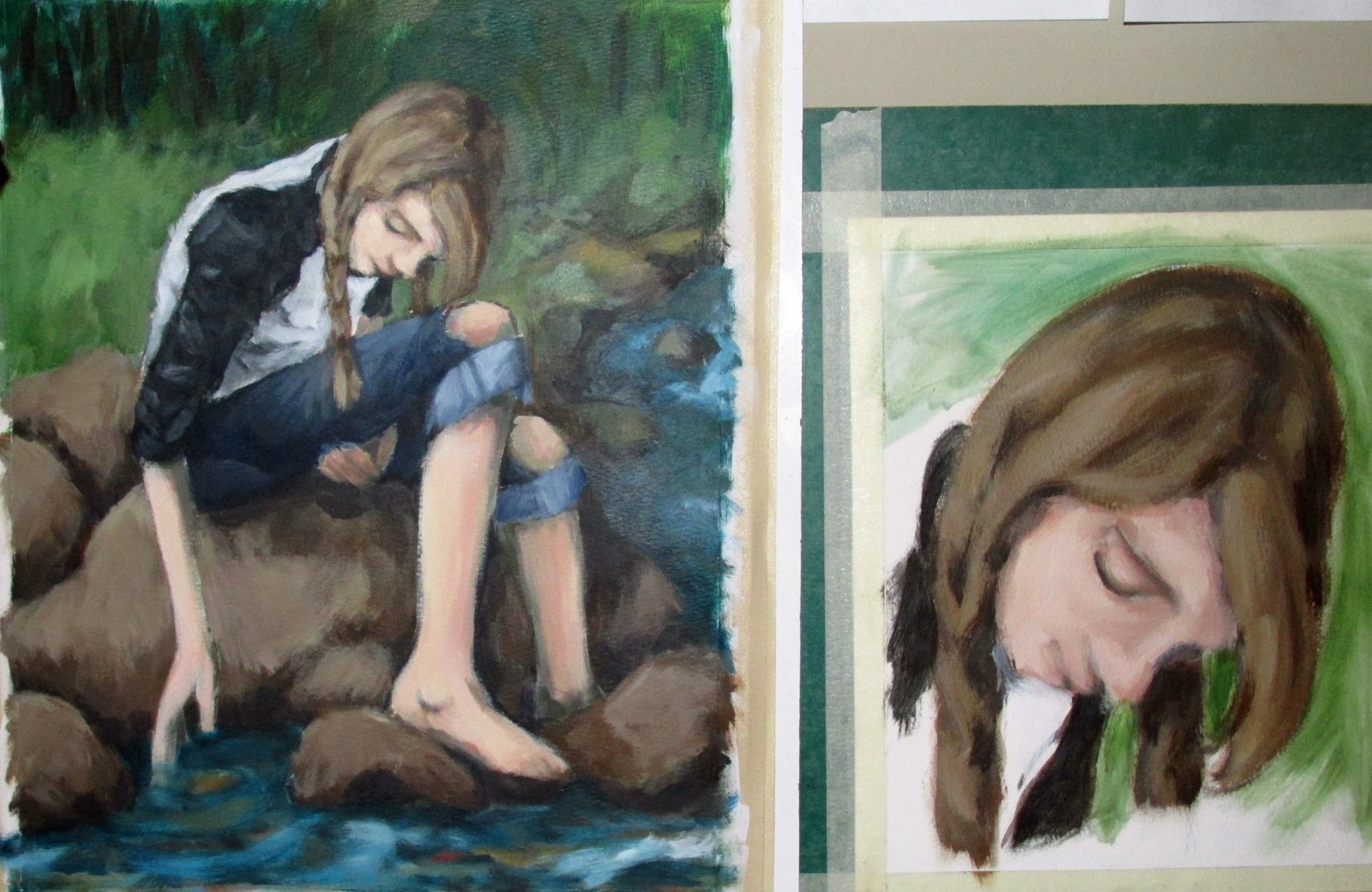
Anyway, that was then and this is now. So, for the last couple of break times at work, instead of drawing from an animal field guide, I grabbed an anatomy book off the shelf. I started with the basics – overall skeleton, hands, and feet. I only get 15 minutes to work on this stuff, so it’s a little rough. But, it does add to my understanding – in particular, the way the bones of the lower arm are turned when it’s in a relaxed position (shown in the arm on our right). The other thing I noticed was how long the bones of the pinky are. One often thinks of the pinky as the smallest digit. But, when you look at the bones that make up each finger (sans all flesh), it's longer than the thumb.

There are some more bone studies I want to do, but I’m looking forward to doing the muscle studies. That will be quite useful for capturing the fleshier parts of the figure. Then I’ll be able to put it all together in my work.
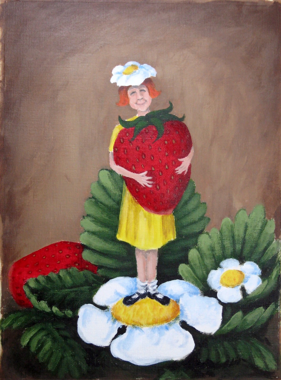