Sunday, March 30, 2008

Work to Be Done

Well, Easter Vacation is officially over. Tomorrow it's back to homeschooling and I'll have to return to just nibbling at the illustration work. That's OK, though. I attended a homeschooling conference over the weekend and it really inspired me to try to do some neat stuff with the kids before summer hits.

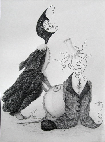
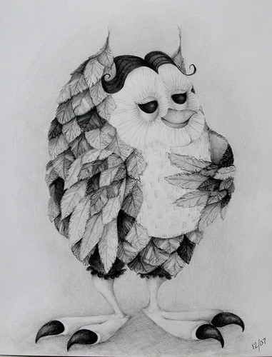
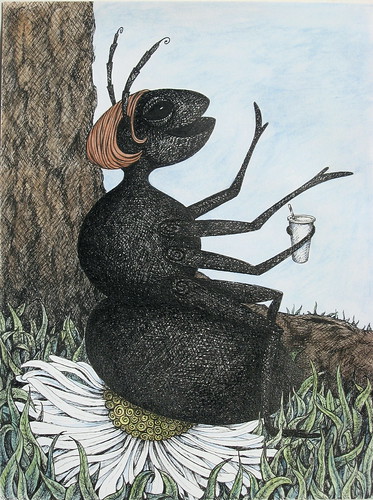
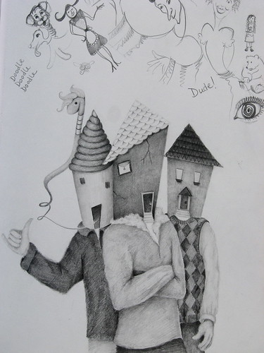
I'm happy with the time I've spent on illustration this past week. I was able to work on two projects that I'd been wanting to revisit - the ant and the drawing from the previous post. Both of those took some time. I even worked on a painting last night. As I mentioned before, that is an area in which much work is needed! Besides getting better with acrylics, I also need to study color.

Back in college, I loved expressionist color palettes - bright and bold. There were some really great German Expressionism shows at LA County Museum of Art back then, and I was really inspired by paintings like the one shown here by Kirchner. Now, however, I want to better understand and work with more natural color when it comes to light and shadows. I realized while painting last night that I have some study to do in that area.

So, my "To Do" list is growing...
1) color "recipe" study
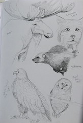
2) bone and muscle study
3) continue experimenting with more materials
4) keep on doodling

Friday, March 28, 2008

It's Done...Kinda...I Think...

IMG_0496

TA-DAAA! Ok, well it's MOSTLY finished. I know I'll go back and tweak things a little here and there - I usually do. But, I don't think I would alter very much at this point and I can officially step away from it.

I like how the cape turned out on the textured paper - it has the feel of thick, heavy wool or something like it. You can really see the difference in between the original sketchbook drawing on smooth paper (below left) and the final (below right).

Like I mentioned in the previous post, this project forced me to look at paper a little more carefully - it can really have an impact. While it worked well for the darker cape, I battled more with the coat on the short figure. I'm still not sure I'm satisfied. Perhaps I need to go over it again - go for a little less contrast. I don't know - maybe I've just been staring at it too long today.

Thursday, March 27, 2008

An Unexpected Lesson in Paper...

My streak of posting everyday was finally broken. We went with friends on a hike and picnic yesterday to a nearby waterfall. Afterwards, I had to go to work, so I just hit the bed once I got home.

I did manage to spend a couple hours in the studio today. I'm working on a pencil drawing based on a previous doodle in my sketchbook. It's pretty detailed and involved, so it's taking a little while. Hopefully, I'll have it finished tomorrow and can share it then.

My biggest surprise with the drawing so far has to do with the paper I'm working on. I've gotten used to working in my sketchbook which is very smooth - absolutely no "tooth" whatsoever - which works well for the shading that I do. The paper I'm working on for this project has a medium texture. It was a really big shock at first. I was shading a pretty large area with some of my darkest pencils and the texture was really pronounced - more contrast between the surfaces getting the pencil and the more recessed surfaces. The texture is barely noticeable with the lighter values.

Actually, it's growing on me. The characters are wearing heavy, dark-colored clothing, and the texture really gives that weighty appearance. I'd love to say I planned this, but no. I'm learning from it, though. I've paid little attention to papers in the past. Now, it's something I will consider more depending on what it is I'm working on.
IMG_0377
Since my new current project isn't ready to share, I'm dusting off an owl "doodle" from my sketchbook. It's a good example of how I like to work with pencil - full value range combined with line work. It's also an example done on the extra smooth paper surface.

Monday, March 24, 2008

Mission Accomplished...NEXT?

Well, I actually finished something that I've been thinking about - but was unable to get to - for months. I redid my sketchbook doodle of "Spectator Ant" and managed to bring it to some level of completion with watercolor washes this afternoon.


IMG_0475


I think I'm happy with it overall. I had originally only intended to do it as an ink drawing, so I used regular drawing paper and not a heavier paper. I was a little concerned about putting washes on it, that the paper wouldn't hold up very well. It did buckle a bit, however a low heat iron smoothed it out quite nicely.

So, what's next? I've got the week ahead of me (sort of). Should I do some new doodles? Or revisit old ones? Actually, there is one doodle that I'd like to redo since I destroyed it with an awful background. I'll share soon.

Sunday, March 23, 2008

At Last...TIME!

HAPPY EASTER EVERYONE! It was a beautiful day here - warm and sunny (sorry to those of you in other parts of the country). I was a able to finally get some rest and feel a lot better than I have been the last couple days. And, my kids spent the afternoon with friends at the park down the street. Quite unexpectedly, I ended up with a big block of free time - time that I was able to spend in the studio!

No games or warm-ups today; I went right into a project I'd already started. It was a redo of a doodle that had been in my sketchbook. The thing about doodles is that sometimes lines, shapes, gestures, and values get sealed into the drawing before you determine what it is you're actually making. There's no going back and simply altering.

That was the case here. I had done the first drawing of the "Spectator Ant," but I wasn't happy with the way parts of it had turned out. I really haven't worked with ink very much, so I was out of my comfort zone - I didn't get the amount of contrast I'd wanted, and I was overly rigid with my cross-hatching.

So, on this redo, I was able to loosen up and do more of a "scribble" type of shading (like I do when sketching with pencil). I think it brings more energy to the image. Also, I fixed some things I didn't like - the eye and some general shapes and sizes. I added a little pizzazz to the flower and "super-sized" the ant's beverage. Note: the original doodle-drawing and details are all shown on the left - new improved "redo" details are all on the right (Complete "redo" is down on the bottom).

Overall, I'm much more pleased, although I don't know how much of a difference can be seen on the computer. Many of the changes were just technical, gestural, or cosmetic, but even a few small changes can still make a big difference. Now, I'm deciding whether or not to add some color - probably watercolor washes.

I think I will...


Saturday, March 22, 2008

Let Sleeping Laundry Lie...


I usually always keep a sketchbook with me in case I encounter a drawing moment or sudden inspiration. However, at home yesterday, I still didn't have one close enough.

It happened while I was trying to rest for a half hour before I had to go to work. I'd brought in some laundry from the dryer, tossed it on the bed, and flopped down next to it. But, as I began to relax, I found myself face to "face" with one of my crumpled shirts. Now, I've always been pretty good at picking out images in clouds or other random shapes. But in this case, the shapes, folds, and shadows of the shirt formed a clear and distinct image - a pleasantly slumbering face.

My first thought was that I should record it in my sketchbook. However, it was still out in the garage on my drawing table. I was sooooo looking forward just a few minutes of relaxation, but everytime I opened my eyes, I saw the face. Finally, I got up and went for the sketchbook to record the image. I drew it exactly as I saw it - can you see it, too?
Bottom line is that I really need to keep a sketchbook within arms reach. As for the laundry, I had to go to work and leave it where it was for the time being. Afterall, the shirt looked so content - why wake him? At least one of us got to sleep.

Friday, March 21, 2008

A Little Monkey Business...


I was able to squeeze out a whole hour in the studio yesterday with all that was going on. I did my little drawing "warm-up" game - this time the theme was monkey and the material was oil pastel.

To be honest, I really haven't worked with oil pastel except with kids - the usual watercolor resist activity. I probably started working on too small a scale in my sketchbook. Oil pastel doesn't involve any fine tips, so it would be a good thing for me to work with in fostering a greater "looseness" that I would like to explore a little more.

Since I was just working out of my head, I think my monkey came out looking a bit like Curious George. So, while I was on my break at work, I found an image of a real monkey (a Capuchin) to practice.

So, now it's another day that can work in the studio before I have to go to work at the bookstore. However, I woke up feeling a little ill - sore throat, drained of all energy, etc. I hate to miss out on this chance to draw (now that I finally have it). But, I also feel the need to sleep. Perhaps I can squeeze in a little of both.

Thursday, March 20, 2008

Spring Fever

IMG_0386
It's the first day of spring and it's a beautiful day here is California!! The kids had P.E. this morning (the Presidential Physical Fitness CoOp) and there's the 1st day of indoor soccer practice later this afternoon. After that, it's off to work I go (Hi Ho).

So, if I'm going to have any studio time, I'd better skip the chatting and get out there. I thought I'd share this image from my sketchbook as it's appropriate for today (done last fall).
Also, where possible, I've added some Youtube video of some of the artists and/or songs to several of the links in my "Sounds From the Studio" sidebar. Have a listen, if you'd like.

Wednesday, March 19, 2008

A Game to Get Things Rolling...

It's funny how when you finally have time for yourself, you still manage to fill it with a lot of "other" things. In spite of having the night off from work, it was still after 8:00 p.m. before I finally let myself go out to the drawing table. Then, I was really too tired to do much - just a smidge of sketching. Besides, my studio is in the garage - a little chilly in winter (even if I am in California with a space heater).

Anyway, today was different. I did have some morning stuff to do, but I managed to get out to the studio around 12:30, just after lunch, and spend a good 2 hours solid. I have to work tonight, so I have to figure in a little "rest" time and dinner prep.
IMG_0459
Since time is precious and I can spend a great deal of it trying to decide what to do, I came up with sort of a game to help me get started. I figured it would serve as a "warm-up," but if I get into what I'm doing, then I'd just keep going. I simply wrote down about 25 different subjects such as farm animal, household furniture, buildings, etc. on different pieces of paper and threw them into a bowl. I did the same with several different materials such as charcoal, ink, watercolor, etc. I then chose one paper from each bowl - the subject I would warm-up with and the material I would have to use. I did it today for the first time and came up with "bear" and "colored pencil." (shown above)

I probably worked on it for about 30 minutes before I moved on, but it turned out to be a fun way to get the creativity flowing. I'm not sure that the bear's foreshortened leg is very accurate, but I didn't have a bear handy. When I got tired of working on it, I switched over to a project that had been a doodle, but I'm redoing it as a completed picture. I'll share that in a future post.

Tuesday, March 18, 2008

A Little Less Talk and A Lot More Action...

Easter Vacation is here(ish). Well, I think the schools take off after a half-day tomorrow and then the whole next week. We've finished math, spelling, and science units - no need to start new ones at this point. The kids are doing some work on their projects for the Science and History Fair coming in April - painting models, building dioramas, planting seeds - fun stuff. There's little help they need from me at this point.

Sooooooooooo, that means TIME OFF FOR MAMA! Now, I can spend some chunks of my days actually working on some illustration stuff - in between cups of juice, peanut butter and jelly sandwiches, etc. (and you know 3 kids can't ever ask for it at the same time - they have to wait until I get settled and then ask separately).

And, since I keep mentioning my 3 kids in this post, I guess I'll share a page from my sketchbook done last fall sometime (they're not my kids obviously - just another doodle).

IMG_0383

While I've been blogging up a storm, I've really only included works that are sort of recent (and a couple from a long time ago). I've had little time to work on anything new. Hopefully, I will have something new to share very soon.

Monday, March 17, 2008

The Style "Trap"

I used to think in terms of trying to work towards a particular style, to build something that was uniquely ‘me.’ When I was in school, I wanted to be perceived as fresh, new, or cutting-edge. Well, we now know how that turned out. But now, a couple of things have turned my thinking around (actually many things, but I’ll only focus on 2 incidences here).

For the first, I have to refer back to Paul O. Zelinsky again – the subject of my very first blog post. If you look at his work, he offers a wide variety of styles. The November ’07 issue of The Artist’s Magazine states:

“What’s interesting about Zelinsky’s work is that the tone of his work changes in response to the demands of the text.”

This makes perfect sense to me. Each story to be illustrated will have its own unique personality to be considered based on its characters, setting, overall mood, and intended audience. Zelinsky does everything from lighthearted and childlike images to work reminiscent of the Italian Renaissance.

About his approach, he says:

“My preferred way of working is to start with a manuscript and try to imagine what the ideal art should look like for that particular voice, that particular world. Then I see if I can figure out how to make pictures in something like that style.”

There are some artists who, I think, limit themselves by developing a strong individual style and not straying far from it. It becomes their signature way of working, but they face being type-cast. My goal is to try NOT to pigeon-hole myself.

The other revelation I had on this issue came from Martin Salisbury in his book Illustrating Children’s Books. He states (italics are mine):

“Style is a word that other people use when talking about your work. If drawing is to develop naturally and with integrity, it is vital that you do not consciously pursue a ‘style.’ The process of working honestly, and with passion for your subject matter, will allow your work to evolve and develop its own identity.”

Sunday, March 16, 2008

More on Character and Style – Depicting Different Ages

While we’re on the topic of character development, the project mentioned in the prior post required me to deal with another issue – how to show a character’s intended age.

My background in fine arts means that I have taken several classes related to the figure. However, there was never any opportunity to really compare anatomical differences between adults and children; we just focused on the (always) adult model before us.

So, that brings me to the main character of the book – a girl about 8 or 9 years old. I dove right in and created, playing with line, texture, and gesture. I was pleased with the result…at first. In time, and with some valuable insight from others, I realized that she appeared much older (and more sassy) than I wanted. Not to mention, I got a little overzealous in creating a shadow at the hemline so she looks a little “hairy” on the legs. Anyway, it was clear a redo was in order and the result is shown below (1st attempt on left; redo on right)

IMG_0391 IMG_0392

This realization forced me to study more closely what characteristics make a toddler a toddler, a child and child, a teen a teen, etc. There’s the familiar head count – a standard male is about 8 heads high and a toddler is about 4 heads. Everyone else is in between somewhere. And, to tell the truth, I had to look that up – I tend to eyeball it myself.

But, in general, I found younger kids to have larger heads, rounder cheeks, and shorter necks along with their shorter stature. They might also have longer lashes, thinner brows, wider set eyes, and more indention at the corners of the mouth.

A couple of helpful resources that I used was the tried and true “Drawing the Head and Figure” by Jack Hamm, and “Drawing People” by Barbara Bradley.

Saturday, March 15, 2008

Considering the Target Audience - The Issue of Character and Style

Recently, I dusted off an old idea that I thought would be a good “assignment” for myself. It’s one thing to invent a character and move on, and another to actually carry them through an entire picture book. My target audience for this project is kids 4-9 years old who are moving into homeschooling – kind of a “get ready for school” book from the homeschooler’s perspective (the issues are completely different).

Anyway, I found myself struggling to determine the style I wanted to work in. I’m drawn toward wanting to do unusual characters (lots of that in my sketchbook). However, they can sometimes come across as a little dark or unsettling. This book is meant to be positive and encouraging, and to represent real-life experiences that kids could easily associate with.

Since I want it to appeal to a range of ages, I figured it should be fun and colorful without being TOO cartoony and babyish. On the other hand, I don’t want anything too serious, “textbookish,” and dull. (Maybe I could have picked an easier first project)

Well, I came up with some characters (done in ink with watercolor washes) that I kind of like. They’re fun and colorful, but I’m not sure if they’re borderline too cartoony. I think I’ll try to do some studies placing the characters within a setting – perhaps then I could see it as more of a whole, and that will help me decide if I should push them toward the “real” a little more.

In this post, I’m showing 2 of the 3 characters – the older brother (aprox. 12 years old) and the youngest sister (aprox. 5 years old). The main character I’ll address in a future post.

IMG_0393 IMG_0394

Friday, March 14, 2008

Too Tired to Write Much, But...

Since I began blogging, I've really enjoyed posting, figuring out how to add pictures (and get them where I want them), and browsing all of the blogs out there.

I've come to the conclusion that there is A LOT of great work out there!!! I've come across so many creative people - artists AND writers. Some are already working in their field while others are hoping to (like myself). One thing's for sure - I've got my work cut out for me! I'm glad I've given myself time to develop. There's lot's to work on before I could ever think of throwing my portfolio into the ring.

I appreciate any comment or feedback that anyone wants to throw at me along the way.

By the way, just for fun I thought I'd introduce Basha (A.K.A. Boo-Dog) my drawing buddy. If I'm out at my drawing table, she's at my feet (often sleeping on them). This, however, is her during one of her friskier moments.


Thursday, March 13, 2008

McCarty - A Recent Discovery

I’ve just discovered an illustrator whose work I really admire. Well, actually I have seen a couple of his books and made note of the covers many times, but I’d never really looked very closely at them. However tonight, it was painfully slow at work, so I took the opportunity to study some of the children’s books we have in the store.

The artist is Peter McCarty. He’s able to achieve an effect that I have played with since my college days – graphite and colored pencil used together (or at least that's what it appears to be). It gives the appearance of a color-tinted black and white picture that I really like.

My approach has been to do a drawing fully shaded in pencil and then color over it with colored pencil. This resulted in a smearing of the under-drawing that I didn’t like, giving some of the colors a “dirty” appearance. It looks as though he mainly uses hatching and cross-hatching rather than smooth, seamless shading like I do. Another difference between our approaches is that his illustrations have a hazy, all-over softness about them while mine employ more of a hard edge.

I’ve included a couple images of mine where I’ve used colored pencil over pencil – the one on the left was from about 17 years ago in college; the one on the right was done just recently in my sketchbook - both began as doodles.

IMG_0410 - College Days drawing IMG_0387

I was a little discouraged by one thing – I once thought the approach of working with colored pencil over pencil was unique since I hadn’t seen it anywhere. But, I guess like most everything, it’s “been done” in some way by someone. On the other hand, it’s encouraging to see another artist working successfully with pencil (he’s a Caldecott winner)

Wednesday, March 12, 2008

How 'bout Some Color?


IMG_0390
Originally uploaded by sdzsmith
One thing I’ve come to realize is that I am much more confident in my drawing skills than I am in my painting skills. After all, I can draw anywhere with any kind of pencil or pen, so I’ve had a lot more practice. Painting isn’t quite as “portable.”

In college, I had worked exclusively in oils. But now, for practical purposes, I’m experimenting with acrylics. While it’s speedy drying time has it’s benefits, it can also be quite frustrating. I’m used to being able to go back into an area and still be able to blend colors. I suppose I could work with and extender – or I could just learn to deal with it..

Probably most annoying to me is the fact that acrylic paint colors are a little different when dry than when wet. I think I’ve built up just the right amount of contrast, and then it dries and doesn’t quite have the same “punch.” But, I guess I’ll get used to that, too.

I’ve included a recent attempt at exploring acrylics. My affection toward drawing in detail is, I think, getting in the way of the looser, painterly effect that I’d like to have. Oh well…bottom line is that I need to log more hours working with this medium. Maybe over Easter Vacation.

Tuesday, March 11, 2008

Animal Studies

As I already mentioned, my drawing time is pretty limited at the moment. But, I always take my sketchbook to work with me and draw during my breaks.

Although I try to work from life whenever I can, the nice thing about working in a bookstore is the selection of resources that I have to work from. I like to grab one of the field guides from the Pets and Nature section and head off to the back room (the next best thing to drawing at a zoo). My goal is to get familiar with the characteristics of different animals by drawing them realistically. That way, I will have the drawings to refer back to, OR some of those characteristics might materialize in one of my future doodles.


IMG_0382 IMG_0381


Sometimes I’ll work from some of the DK baby books that contain real photographs of babies and toddlers showing different positions and expressions. For older kids, I’ll just recruit one of my own kids to pose if I’m stumped on how a limb should be positioned.

Here, I’ve shown 2 of my sketchbook pages with some of the animal sketches. I especially like how the badger, the groundhog, and the wolverine turned out.

Monday, March 10, 2008

OK, Here's the Plan...

I wasn't exactly sure what the purpose of this blog would be when I set it up a few days ago. All I knew was that it would be related to my art in some way. However, that purpose became clear to me earlier today. This will be a journal of my experiences as I attempt build a career in illustration. Since this has been a fairly recent decision in my life, this blog will be a chronicle of my efforts from the very beginning to some sort of end.

There are only two possible outcomes to this adventure:

1) Yeah! - a successful career! And, look what it took to get here!
OR
2) Woe is me - can't seem to make it in this field. But, I tried my best.

Time will tell which outcome it will be, and we'll see how it all unfolds.

At the moment, finding time to draw and paint is the biggest challenge I face. My primary focus right now is family and homeschooling my children - that will keep me busy for several years to come. The bulk of my work has to take place on weekends, holidays, and summer vacations. Then, once the kids are older and more independent in their studies, I will have a portfolio ready to shop around (that's the plan, anyway).

So, now I feel like Dorothy in Munchkinland, taking my first steps on the yellow brick road. Either I'll make it to the Emerald City or the witch will get me. We'll see...

Sunday, March 9, 2008

The Journey Begins...


Early Sketchbook Doodle
Originally uploaded by sdzsmith
Before I even came upon the previously mentioned article, I guess I would have to credit my 12 year old son's honesty in getting me back into my art. I was going to be teaching an art class for the first time in a long time. So, with a grin he told me I'd better practice because I was out of artistic shape.

True enough. I had gotten into doing stained glass for fun after college, but I really didn't do much in the way of drawing and painting. So, I bought a new sketchbook, dug out my pencils, and figured I'd just doodle and enjoy. That way, I could just play with the materials and not worry about the subject matter.

Pictured here is one of the first pages in the new sketchbook. The doodle started with a number 7-ish grouping of lines that formed the upper right corner of the brick structure, and it grew from there. I had no idea what it would be as I worked through it, but this is how it ended up.

While it's not a perfectly "finished" drawing, it serves as a unique idea for something I could use in the future. And, it turned out to be a great review in creating value with the variety of pencils.

Thursday, March 6, 2008

Thank You Paul O. Zelinsky!

It's funny how things work out.

About 15(ish) years ago I was finishing up my degree in Fine Arts at California State University in Long Beach. I chose to specialize in drawing and painting, although I wasn't sure what I was actually going to do with it. I did, however, manage to find art teaching opportunities in a private school and a few workshops over the years.

Fast forward to the present...after coming home to homeschool 3 kids (which is still in progress), I've found myself working part-time in a bookstore. Not long ago, I picked up an issue of The Artist's Magazine that showcased an article about Caldecott winner Paul O. Zelinsky. It turned out to be an unexpected turning point for me when I read the following:


"...art purists have traditionally made a distinction between fine art and all forms of illustration, often viewing the latter as inferior work that can't hold its own."

Mr. Zelinsky goes on to speak about his experience at Yale: "In the art department, illustration was a derisive term."

BINGO! I completely understood what his experience had been, because I had gotten the same (mostly) unspoken message in my art department. I can even recall one occasion when my professor got into a heated debate with a classmate (who happened to be an illustration major), insisting that illustration was not real art.

Why did this matter? Well, I guess back then, my youthful ideals and I didn't want to pursue a "lesser" form of art. In spite of the fact that my work fit quite naturally into the illustration category, I fought against that tendency and never really found my artistic groove.

But time, wisdom, and a few words in a magazine have started me on a new creative journey. At long last, I've come to embrace the idea of illustration. Who knows...maybe I'll have a future in it as my kids become more independent. Regardless, I've never had more focus (and fun) building a portfolio!