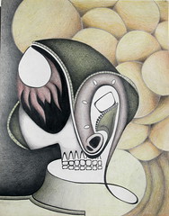
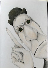
 The artist is Peter McCarty. He’s able to achieve an effect that I have played with since my college days – graphite and colored pencil used together (or at least that's what it appears to be). It gives the appearance of a color-tinted black and white picture that I really like.
My approach has been to do a drawing fully shaded in pencil and then color over it with colored pencil. This resulted in a smearing of the under-drawing that I didn’t like, giving some of the colors a “dirty” appearance. It looks as though he mainly uses hatching and cross-hatching rather than smooth, seamless shading like I do. Another difference between our approaches is that his illustrations have a hazy, all-over softness about them while mine employ more of a hard edge.
I’ve included a couple images of mine where I’ve used colored pencil over pencil – the one on the left was from about 17 years ago in college; the one on the right was done just recently in my sketchbook - both began as doodles.


I was a little discouraged by one thing – I once thought the approach of working with colored pencil over pencil was unique since I hadn’t seen it anywhere. But, I guess like most everything, it’s “been done” in some way by someone. On the other hand, it’s encouraging to see another artist working successfully with pencil (he’s a Caldecott winner)

No comments:
Post a Comment