
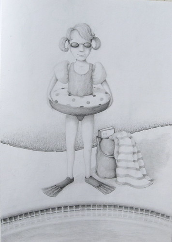
Ok, I think I brought this one to a resolution. I was stuck for a little while - there was too much negative space before, but everything I added just cluttered the scene. Everything seemed to draw attention away from the figure. So, I posted it on Amateur Illustrator, got some feedback, and this is what I came up with.
Simply adding another edge behind the figure definitely improved it - the figure feels more grounded, the space a little better defined. But I think this is one of those instances where the blank, white space is necessary. The white space to the left of the figure's feet balances the bag and shadow that are off to the right. The large amount of empty space in the upper half of the picture balances the multiple patterns and darker values toward the middle and bottom.
The thought has crossed my mind - what could I put in the upper part of the picture? I tend to like to place elements (objects, values, patterns, etc.) around to draw the eye around the composition. But, I come up with nothing that would fit or make sense - the empty space is serving that purpose without stealing the spotlight, allowing you to focus in on the girl and all her gear.
1 comment:
you have a wonderful blog. i know very little about illustrating, but it's fascinating to look at your pictures, read what you have to say about them, and know a little about a creator's family life.
Post a Comment